Conversion Rate Optimization (CRO)
Case Study for Supplement Manufacturer
This is a case study on both the impact and the importance of Conversion Rate Optimization (CRO) as a key pillar for a successful campaign. When we were first approached by a leading supplement contract manufacturer, they had recently expanded their plant capacity and were looking to acquire new clients for their operation. They had tried different supplement marketing agencies, none of which had been able to get them any meaningful results after spending thousands of dollars in pay per click ad campaigns.
During our Discovery Call, it became clear that while the PPC campaign ads needed optimization, it was the landing page that needed the most work. With an average conversion rate of around 0.8%, the few RFQs they got came at a high cost per lead of about $150. We explained to the client that as part of our campaign management services, we would perform ongoing Conversion Rate Optimization (CRO) to the lead generation landing page. Our efforts and key changes to the page are detailed in the case study below.
The Hero Section
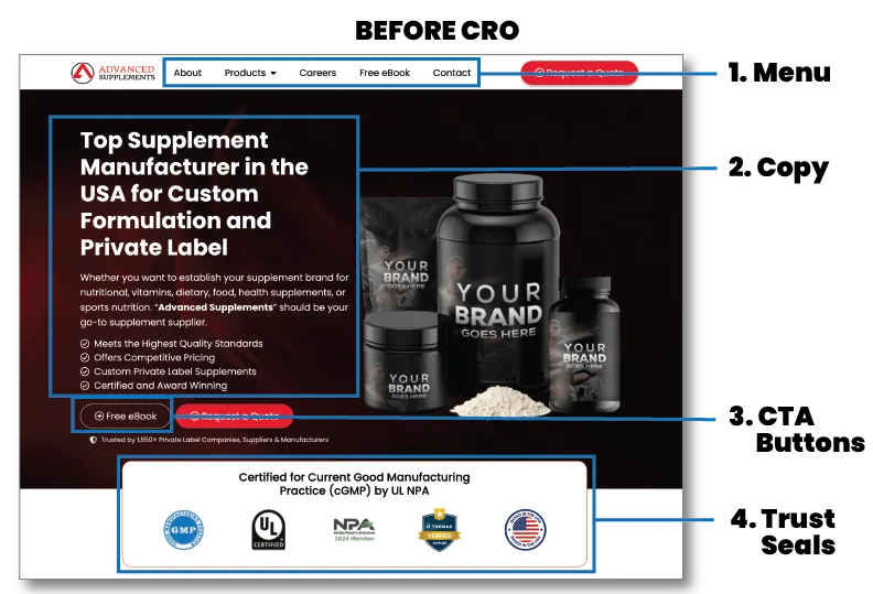
1. Navigation Menu
The main navigation menu was very busy and gave visitors too many options to navigate away from the landing page.
2. Copy on Hero Banner
The main hero banner had so much text on the copy that wasn’t easily scannable and caused visitors to leave.
3. Call To Action Buttons
Throughout the page, there were two different CTA buttons, taking the visitor to two different forms, making it confusing for the visitor to choose a conversion path.
4. Trust Seals
The trust seals ribbon had unnecessary text, making it too tall and pushing the whole graphic below the fold.
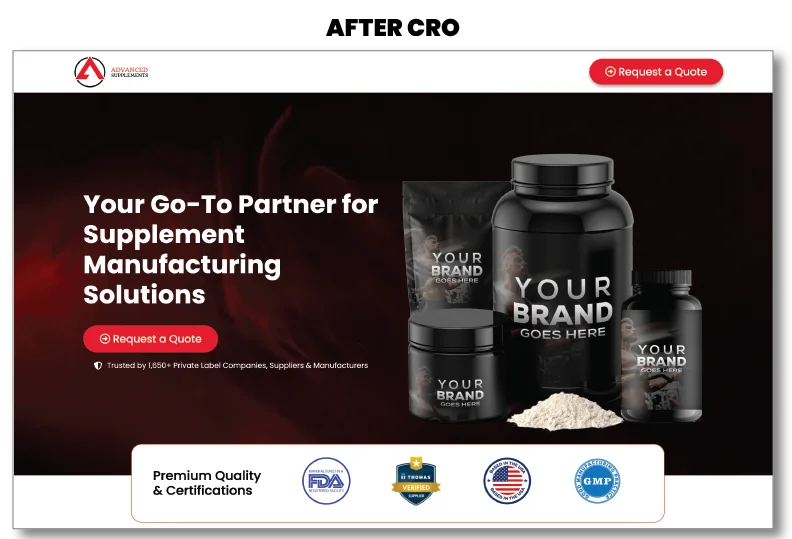
After Optimization
The navigation menu was removed from the landing page, leaving only the CTA button to request a quote, giving visitors no option to navigate away from the landing page.
The paragraph text in the main hero banner was removed, leaving only an easily scannable headline. We then tested several iterations of the headline.
Throughout the page, we removed one of the CTA buttons, allowing the visitor only one option: Request a Quote.
The trust seals ribbon was streamlined to be displayed above the fold in most screens.
Layout and Content Optimization
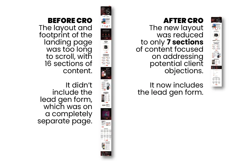
5. Page Layout and Footprint
The initial layout of the page had 15 content sections. This created a very long footprint that made it too long of a scroll for any visitor looking to engage and convert. Even if they did scroll all the way down to the bottom of the landing page, they would not have found the lead generation form, because it was on a completely different page.
6. Page Content
A lot of the copy in the content was repetitive and wasn’t organized to fit a sales narrative. We rewrote several iterations of the content and restructured it to follow a strategic narrative designed to portray authority and trust.
Lead Gen Form Optimization
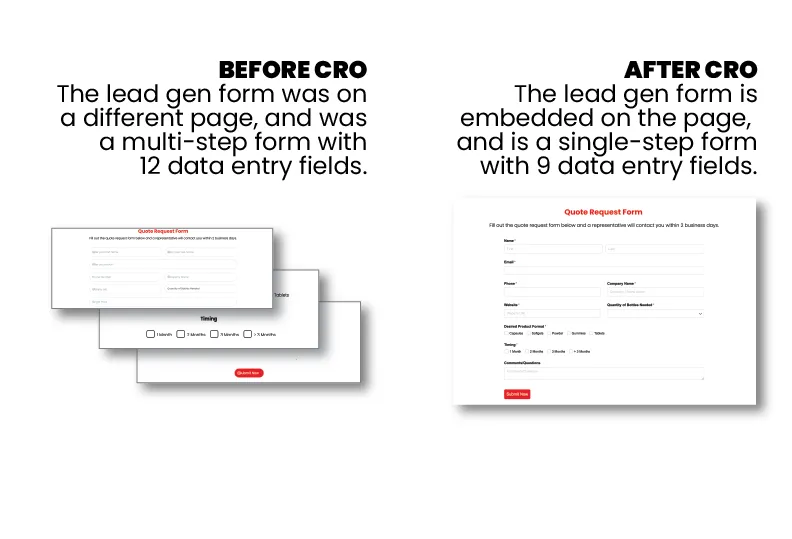
7. The Lead Generation Form
The original lead generation form used on the site was built using the built-in forms builder in their WordPress theme. In addition to the form not being on the same landing page, it was a multi-step form which required 3 consecutive screens with 12 fields before a visitor could submit the form. Every time a visitor is forced to click to go to a new screen, there is a significant drop-off, and in this case, a visitor had to click through 4 different screens to submit their form.
We condensed the form to a single screen, shortened the form to have fewer fields, placed it on the landing page, and tested a few different versions of it. Lastly, we connected it to the client’s CRM platform.
Loading Speed Optimization
8. Page Loading Speed
Because of the original length of the landing page, it had a large number of graphic elements. Many of those elements were large graphics that hadn’t been optimized. Online shoppers are impatient, and would likely wait no more than 3 seconds to allow a website to load and make a first impression on them.
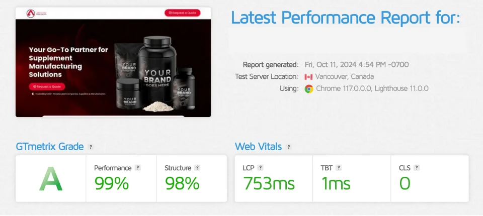
By shortening the content, reducing the number of elements, and optimizing the size and format of the images to be .webp, we were able to reduce the loading time of the page from over 3.7 seconds to just under 1 second. This resulted in a near perfect A speed rating.
The Result: 10x Improvement
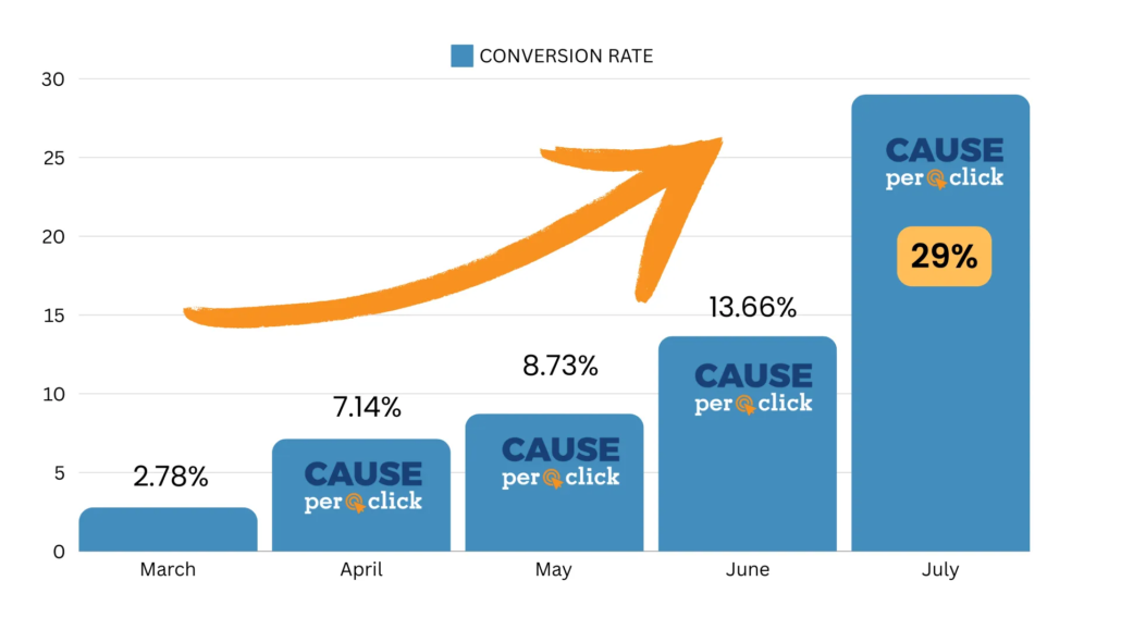
The Conversion Rate Optimization journey for this landing page had four different iterations over the course of the same number of months. Before we started working with them, their conversion rate was less than 1%. On our first month of work, we increased it 3x to 2.78%. On the second month, we again boosted it by a 2.5x factor to 7.14%. Successive iterations gave us further improvements, until the latest version produced a conversion rate of 29% and a Cost Per Lead (CPL) as low as $10, KPIs which are nearly unheard of for a B2B lead generation campaign. These results are not typical.
