 Photo from Unsplash
Originally Posted On: https://www.12sm.agency/medical-logos/
Your logo design is one of the first aspects of your hospital, medical office, pharmacy, or healthcare organization potential clients will interact with.
This counts for online interactions they’ll have when they search for “hospitals near me” and similar search terms as well as interactions they’ll have through ads you have in the wild.
Yes, patient reviews, medical website design, and even your healthcare marketing strategies all have a greater impact on how your brand encourages potential clients to reach out.
Even so, you shouldn’t discount the influence an effective logo design can have.
That’s why in this post, we’ve rounded up 12 of the best logos in the healthcare industry and how each organization approached their designs.
Let’s get started!
12 Healthcare Logos to Use as Inspiration
A quick summary of our top three options from the list below:
- CVS – A major chain of pharmacy and drugstores in the United States, CVS’ logo features a block-like heart design in a deep shade of red.
- Pfizer – One of the largest pharmaceutical and biotechnology companies in the world, Pfizer’s new logo includes its own spin of a double helix.
- Lilly – An American pharmaceutical company, Lilly’s logo uses a script font that resembles founder Eli Lilly’s signature.
1. CVS Health
CVS Health is a major healthcare retailer in North America. They operate over 9,900 locations in 49 states, Washington DC and Puerto Rico. They’re widely known as a popular drugstore chain in the United States, but they also operate pharmacies at most of their locations and healthcare clinics at some.
CVS unveiled this new iteration of their logo in 2014 as part of their rebranding strategy. Before then, the company’s primary name was CVS Pharmacy, a name that undermined all of the other healthcare services it provided.
The CVS heart, as it’s been called, was designed as a way for the company to distance itself from its primary “CVS Pharmacy” brand. They wanted to prove their worth as more than a simple chain of pharmacies.
The heart uses a modern, block-like design and CVS’ classic brand color. This color coincidentally resembles a color many of us think of when we picture hearts, making it instantly recognizable even without curved tops.
The block-like design was also created for versatility. You can turn the heart on either of its sides to represent a pointer or bracket, two icons typically used to showcase importance.
Outside of the heart, the logo features the brand name “CVS Health.” The “CVS” part, like its predecessor, uses all capital letters in a sans-serif font and bold style. It also has the same shade of red as the heart.
The “Health” part is meant to contrast the first half of the logo by featuring a serif font, lighter weight, and black text.
Combining a distinguished icon with its classic text logo allows CVS to use its modern heart design on its own in marketing materials. This allows for simpler, more sophisticated marketing designs.
2. Pfizer
Pfizer is one of the largest pharmaceutical and biotechnology corporations in the world, having manufactured such medications as Zoloft, Viagra, and Lipitor. They were founded in Williamsburg, New York in 1849 by German immigrants and cousins Charles Pfizer, a chemist, and Charles F. Erhart.
The company has grown steadily over its over 170-year history by developing and producing multiple products, including a decades-long production of citric acid and mass production of penicillin during World War II.
Today, the company is a multinational corporation that develops and produces medicines and vaccines for various areas of medicine, including immunology, oncology, cardiology, endocrinology, and neurology.
Pfizer adopted its pill-shaped logo in 1940 and switched to a blue pill-shaped logo in 1990 after the release of its blockbuster drug Viagra, which has a similar design.
However, the company changed things up entirely in 2021 with the release of a brand new logo. The typeface is the same, but it’s now accompanied by a stylized double helix, a visual representation of a double-stranded DNA molecule.
The helix is meant to demonstrate Pfizer’s dedication to the science behind medicine after its name became widely known as one of the first companies to bring the COVID-19 vaccine to the United States.
It features two different tones of blue, one of which is used for the typeface fixated to the right. It uses a combination of serif and sans-serif letters.
Some instances of the logo are all blue, all white or all black.
3. Lilly
Eli Lilly and Company, or Lilly for short, is an American pharmaceutical company headquartered in Indianapolis, the same city it was founded in over 140 years ago. Pharmaceutical chemist and Union army Colonel Eli Lilly founded the company in 1876 after dissolving a partnership in which he co-owned and operated a drug manufacturing operation.
The company was the first manufacturer to mass produce the polio vaccine and insulin. Today, they’re known for producing Prozac, Dolophine, Cymbalta and Zyprexa. They’re also second to none in the manufacturing of psychiatric medications.
Lilly uses a simple typeface logo with no emblem. It’s a cursive-based font in an italicized style that resembles the founder’s signature.
The typeface has used a different style in terms of the letters’ appearances over the years. Today, it has an elegant style that’s much simpler than typefaces the company has used in the past.
The entire logo is in a deep, crimson shade of red, giving the logo a striking appearance, especially against white backgrounds.
4. Novo Nordisk

Novo Nordisk is a multinational pharmaceutical company based in Denmark. The company was founded in 1923 when it mass produced the use of insulin in pharmaceuticals, a key treatment for diabetes that helps the body maintain blood sugar levels.
Today, its diabetic care products are used by over 32 million people around the world as it manufactures over 50% of the world’s supply of insulin. This includes over 1 billion of its innovative insulin pens that come in multiple formats to suit different patient needs.
Novo Nordisk adopted the Egyptian Apis bull deity in its logo in 1925, and it’s been a part of every new iteration of the company’s logo ever since. Apis was a sacred bull the Egyptians saw as a god of fertility.
He was kept in the Temple of Ptah, a creation God, in the ancient Egyptian capital city of Memphis.
When he was presented to the public by way of a walk through the country, he was said to have blessed all who resided in his path. This depiction coincides with Novo Nordisk’s 100-year mission to treat those living with diabetes and similar illnesses globally.
Some statuettes and graphic depictions of Apis include a sun disk atop the bull’s head between his horns. This is depicted in the emblem portion of Novo Nordisk’s logo.
The rest of the logo features the company’s name in a sans-serif font in all lowercase letters. This font as well as the emblem are in dark blue, though some instances of the logo are in all white.
Similarly, the logo is most often stacked with the emblem seated atop the typeface. Other instances have both parts on one line.
5. AstraZeneca
AstraZeneca is a British-Swedish pharmaceutical company. It was founded in 1999 when Swedish pharmaceutical company Astra AB, founded in 1913, merged with British pharmaceutical company Zeneca Group, whose roots date back to 1870.
The company is best known for its COVID-19 vaccine distributed throughout Canada and Europe. They also provide medicines and other pharmaceutical products for oncology, cardiology, neurology and gastroenterology, plus respiratory diseases and inflammation.
AstraZeneca has had the same logo since its founding over 20 years ago. It features the company name in a plain sans-serif font and magenta color.
To the right, on the same line, is an emblem. It appears to be a simple, statue-like graphic made up of fancy lines at first glance.
However, upon further inspection, you’ll notice it’s really a stylized version of the company’s initials, “AZ.”
6. Blue Cross Blue Shield
Blue Cross Blue Shield is a US-based health insurance association made up of over 35 insurers. It provides health insurance to more than 110 million Americans or about a third of the country’s population.
The association was founded in 1982 when two niche health insurance companies Blue Cross, founded in 1929, and Blue Shield, founded 10 years later, merged.
The company has taken a literal approach to its logo design since its formation. This design is in two parts.
The first part features two emblems: a blue cross and a blue shield. The blue cross features a simple, almost cartoonish depiction of the famous anatomical sketch (“Vitruvian Man”) of a male human’s body drawn by Leonardo da Vinci in 1490.
The drawings are among the most prominent achievements of science in the Renaissance era. They even influence the basic principles of how scientific illustrations are drawn today. Blue Cross Blue Shield’s use of the drawing as part of its brand identity is evidence of its significance to modern medicine.
The blue shield uses the iconic depiction of a snake that’s been used by the field of medicine for centuries. Many cultures over the years, including the ancient Greeks, have seen the snake as a symbol of medicine, life, death, and even rebirth.
These two emblems together are iconic and recognizable among Americans. They’re often accompanied by the second part of the logo, the company’s name in a stacked layout.
7. Walgreens
Walgreens is one of the largest chains of pharmacies and drugstores in the United States, second only to CVS. It was founded in 1901 and has gone through many business changes throughout its history, though it was always a retailer first and foremost.
Today, it’s one of the most recognizable pharmacies and drugstores in the United States. Many locations even include small healthcare clinics for vaccinations and on-the-spot checkups for non-serious ailments.
The pharmacy’s logo has gone through just as many changes as its business direction in its over 120-year history. From 2005 onward, it mostly uses its classic text-based logo featuring the same cursive design it’s had for over a century.
The logo is flat and uses Walgreens’ trademark shade of red, a prominent color in the medical industry. The company’s “W” design is even iconic, so much so that it sometimes uses it by itself for marketing purposes.
8. Kaiser Permanente
Kaiser Permanente is a healthcare organization that provides health insurance to over 12 million people in the United States.
Its history dates back to 1933 when Henry J. Kaiser partnered with fellow construction contractors to operate a small hospital in California and provide an insurance consortium to meet workman’s compensation obligations of the time.
Today, alongside insurance, it operates a network of doctors, medical offices, and hospitals in various states.
Kaiser Permanente adopted its current logo in 1999. It features a graphic and typeface, the latter of which is often depicted in different layouts.
The graphic is comprised of the silhouettes of three people emerging from a white sun. It’s a simple visual representation of Kaiser’s stance as a fully-fledged healthcare provider.
The typeface uses the company’s name in a sans-serif font and all capital letters. The tail of the bottom of each “e” in the typeface flows into the next letter seamlessly.
The typeface is either stacked or seated on one line depending on which instance of the logo is used. The graphic is sometimes stacked on top of the typeface rather than being fixated to the left of it.
The entire logo is a dark shade of teal.
9. WebMD

WebMD is an online publisher of everything related to health and medicine. Its roots date back to 1996, but it officially adopted the name WebMD in 1999 when it merged with two other organizations.
Today, the website is one of the most influential media companies in the health niche, publishing informative articles on diseases and other illnesses, drugs and supplements, health news, and more.
Its popularity earns it over 130 million visits a month.
WebMD uses its brand name as a logo, in a serif font to be exact. The “Web” portion is in a light blue and italic style while the “MD” is black. Some iterations of the logo place “Web” on top of “MD.”
The logo is simple but effective. It’s also easily recognizable as WebMD has used it for quite some time.
10. Teladoc
Teladoc is a telecommunication service that allows customers to receive medical advice from real doctors through virtual communication. It was founded in the Dallas area of Texas in 2002 and expanded nationally in 2005.
Teladoc’s logo uses a graphic that sits to the left of the company’s brand name. The graphic is a simple circle with thick lines and in royal purple stacked on top of a thick, light blue line with slanted ends.
The logotype is in all caps. It uses a sans-serif font and the same shade of purple as the circle in the graphic.
The top of the “t” in the logotype uses a similar slant as the line in the graphic.
11. Bayer

Bayer is a multinational pharmaceutical and now an agricultural company based in Germany. It was founded by Frederick Bayer as a dyestuffs factory in 1863 but was mass producing their trademarked drug Aspirin worldwide by 1899.
The company lost this trademark in the United States, but it sells its own version of the drug under the brand name Aspirin in over 80 countries, including Germany, Canada, and Mexico.
The company owns dozens of pharmaceutical and agricultural brands. Some of the more well-known names are Aleve, Afrin, Alka-Seltzer, Claritin, MiraLAX, One a Day vitamins, and Roundup.
Bayer’s logo is comprised of a cross created by overlapping instances of its name. The logotype uses a sans-serif font and all capital letters. The letters use a deep navy blue color that almost looks black when used on certain backgrounds.
The logotype is surrounded by a thick ring. Half of the ring is light green while the other half is light blue.
Bayer has used this overlapping version of its logo since 1904, so it’s quite recognizable. However, it wasn’t until 1989 that it adopted the colors green and blue as part of its brand identity.
12. Mayo Clinic
Mayo Clinic is a nonprofit health organization that operates health, education, and research centers in several states. It’s also a popular online publisher of health-related content, receiving over 140 million visits to its website every month.
The organization’s history dates back to 1864 when William Worrall Mayo settled in Rochester, Minnesota, and opened a medical office in the area. The office expanded under his sons and went on to partner with additional practices to form Mayo Clinic.
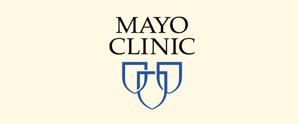
The organization’s logo has two parts: an emblem and a logotype. They’re often arranged differently. Sometimes the logotype is stacked on top of the emblem and vice versa. Other times the emblem and logotype are on the same line.
Mayo Clinic even uses the emblem on its own at times.
The emblem features three outlines of shields arranged in a slight triangle formation. The shield at the front overlaps the other two. It’s most often blue, but the organization uses black shields in some instances. You may also find the shields in white against a blue background.
The logotype features serif font in black text and all capital letters.
How to Design a Healthcare Logo
All of the logos in this list vary in the way they approach presenting the brands they represent. Some, like CVS and Blue Cross Blue Shield, take a literal approach by incorporating healthcare-related symbols in their designs.
Some, like Pfizer, Novo Nordisk, and Kaiser Permanente, use the company’s mission as inspiration for their designs. Others, like Walgreens, Lilly and WebMD, use the brand’s name in a plain fashion, only with a little flair.
Use these different approaches as inspiration for your own logo design.
No matter where you reside in the healthcare industry, ask yourself these questions:
1. What is the purpose of your office, hospital, or organization?
Novo Nordisk is a pharmaceutical company whose primary focus is treating diabetes as efficiently and pain free as possible. Their diabetic care products are distributed all around the world, treating millions of people living with diabetes in various countries.
This is why they’ve chosen a divine deity such as Apis to represent their brand. His presence was said to bless the country wherever he walked, much like Novo Nordisk’s products heal whoever uses them.
Consider your own organization’s primary purpose or reason for existing as a way to help give you ideas on how to use your logo design to communicate your objective effectively.
2. Are there any recognizable symbols you can incorporate?
Blue Cross Blue Shield combines several well-known symbols in their name: a medical cross, a shield, a famous sketch, and Caduceus, the name of the staff Hermes carries in Greek mythology.
Consider if your organization’s name has any recognizable components you can use in your logo’s emblem.
If not, take Blue Cross Blue Shield’s approach and utilize well-known symbols in your logo design.
3. Is your healthcare organization’s name enough?
Walgreens is a well-known name in the United States, so much so that they simplified their logo to the point where only their name is featured.
If your organization has some recognition or even if its name is short and catchy, consider using it as the basis for your design.
Buying a Logo Design
Creating your own logo design is difficult, especially if you don’t have any experience in graphic design. Yes, you can whip one up in a graphic design tool or even a logo generator, but as a professional organization in the healthcare industry, your best option is to have one created for you by a professional.
While you search, look through each designer or agency’s portfolio to see if the designs they used in past projects align with what you’d like to see in yours.
Most importantly, see if they have experience working with healthcare offices, hospitals, and organizations. You’re more likely to find a design you love with a designer who has experience with marketing in the healthcare industry.
Final Thoughts
As you decide on an approach to take with your healthcare organization’s new logo, consider how it will be regarded in the world.
In the world of online shopping, customers take logos, brand names, and even website designs into consideration. Hospitals, medical offices, and pharmacies are no different.
Try to find a balance in your design that effectively communicates what you’re about and the services you offer while also being alluring enough to catch potential clients’ eyes and avert them away from competitors.
Considering where your competitors’ designs fail can also serve as inspiration.
Good luck!